Snip-It Pro 2.0 Deep Dive – The Snippet Explorer
Snip-It Pro 2.0 has been in active beta for a week and I already made a bunch of usability changes. There is nothing like seeing other people use your product to make you realized what small tweaks will make it easier to use. I ended up changing most of the icons, adding a few more menu items and shortcuts and even added a couple of minor features (including the ability to clear your Clipboard History). So please reinstall it if you already tried it and try it out if you didn’t. Click here to download the updated installer.
This will be the first of a series of post that will detail the major features that have been added to Snip-It Pro 2.0. This edition’s topic is the main visual change to the product, the addition of the “Snippet Explorer.”
When Snip-It Pro first came out, the only negative comments I heard about was related to the usability of the user interface for managing snippets. Using snippets, through the drag and drop interface was generally well received, but the pop up style interface and the general menu navigation turned a few people off.
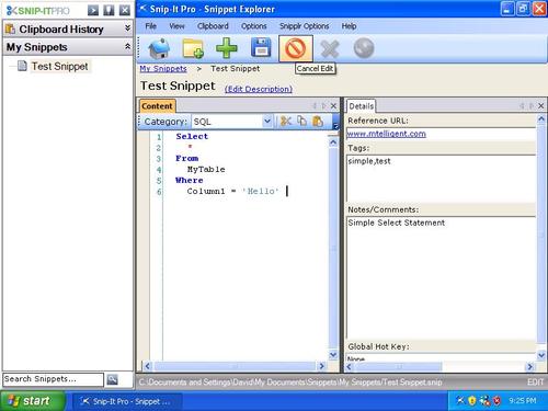
Snip-It Pro 2.0 introduces a new user interface for managing and editing snippets as well setting general program settings and options. This window will hopefully be more intuitive with a standard menu system, toolbar buttons and status bar. This window can be used by itself to navigate through your snippet collections, although it works in tandem with the standard side docking toolbar to allow you to easily manage your snippets. By clicking a folder or snippet in the docked toolbar, the Snippet Explorer will automatically display details about that snippet or folder.
When a folder is selected, the folder view displays all the subfolder and snippets in a “windows explorer” like list. Besides navigation, you can also use the import and export toolbar buttons to send snippets to and from any folder.
When a snippet is selected, a new multi tab interface for editing snippet displayed. The tabs on this screen can be laid out in any layout you desire. Instead of a just a description, content field and notes field, Snip-It Pro enables you to set a Category, tags, notes and even configure a global hot key that will allow you to associate a hot key with a particular snippet.
The list of categories drive syntax highlighting in the new control used to edit snippet content. This will automatically format keywords and literals to support a number of popular languages. Besides line numbers, cold folding and window splitting, you can now even print or “print preview” your snippets.
The toolbar makes it easy to perform the most common snippet operations like create new snippet collections. The standard menu provides a more intuitive interface for setting options and preferences. The status bar displays the file path to where the snippet if physically saved. It also has indicators in the right corner that indicate if the file is read only or being edited. (While a snippet is being edited, clicking another snippet will not navigate it away until it saved or the edit is cancelled).
When you’re not using the “Snippet Explorer,” just close the window. Bring it back by clicking the main “Snip-It Pro” button on the docking toolbar, or just double click any folder or snippet.
So try it out for yourself by clicking here. Leave your comments or send an email to support@snipitpro.com with your feedback.
